Have you ever found yourself drawn to a particular colour scheme in a favourite piece of art or fabric? For many, colour is the starting point for a decorating project. However, while choosing the right shades is essential, the key to a successful interior design lies in how those colours are applied.
The 60-30-10 Rule:
At Neptune furniture, we follow a simple yet effective rule known as the 60-30-10 ratio. This means using:
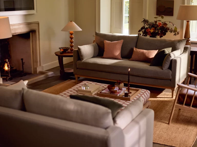
- 60% of the space for a base color, typically a light or dark neutral.
- 30% for one or two complementary accent colors.
- 10% for a bold or bright highlight color.
This approach ensures a balanced and visually appealing space.
The Autumn Palette
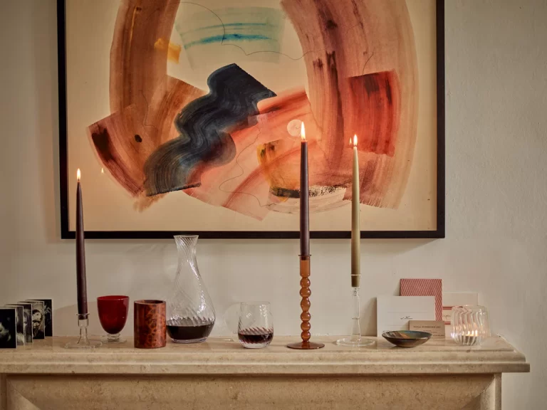
Inspired by the refreshing colors of early twentieth-century interiors, the autumn palette offers a contemporary twist. Combining warm neutrals with sophisticated soft shades and pops of strong color. This departure from the darker hues of Victorian design celebrates a cheerful and fresh aesthetic.
THE NEUTRAL BACKGROUND
SIXTY PERCENT
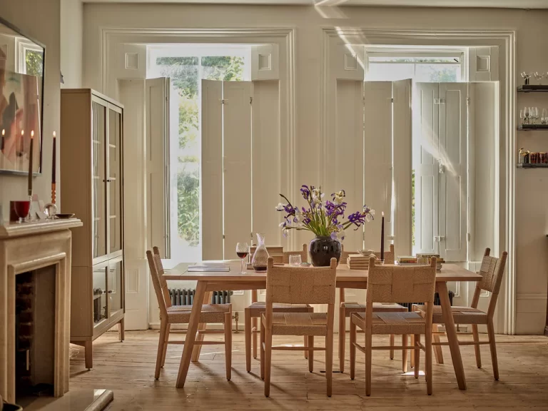
Pick a warm, pink, yellow-tinged white or cream as your base colour. You could try:
Salt, a creamy off-white with a comforting warmth
Silver Birch, a pale creamy-grey, almost an oatmeal shade
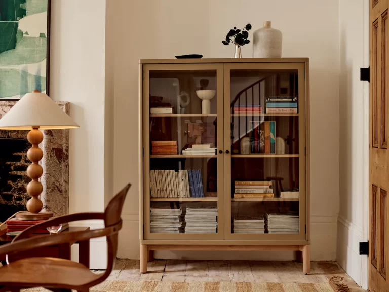
Driftwood, a classic putty colour that feels calm yet cosy
Orkney White, a fresh, soft white that adds subtle warmth
THE MID-TONED LAYER
THIRTY PER CENT
You could take two routes here: a softer palette of Cactus, Flax Blue and Lead Light; or a darker one of Constable Green, Navy and Clove. Both work well with the warm neutrals. You could consider:
Cactus, a deep, relaxing green with a gentle grey coolness
Flax Blue, a hazy blue with a touch of grey that’s muted but deep
Lead Light, a soft khaki; an earthy brown with a hint of green
Constable Green, a rich, inky green that feels enveloping
Navy, a deep, dark blue that feels fresh against white
Clove, a sultry natural shade hovering between deep plum and soft brown
THE FINISHING TOUCH
TEN PER CENT
Bracken, a vibrant, warm orange-brown that brings energy
Blakeney Blue, a fresh, true blue with an underlying warmth
